Dark Mode, Ghost Cards, and a Month We're Pretty Proud Of
March got a little out of hand. In a good way.
This was a month of shipping things that had quietly been on the list for a while — a dark mode, a completely rethought way to view and edit your itinerary items, smarter accommodation tracking across multi-night stays, and a map you can actually use on your phone. Plus a pile of quality-of-life fixes that make the whole thing feel smoother. Here's what's new.
🌙 Dark Mode (and a fresh coat of paint)
The app now supports dark mode. On first load it follows your system preference automatically. Want to switch manually? It's in Profile → Preferences → Appearance, and your choice is remembered between sessions.
Alongside dark mode, the whole app got a visual refresh. The palette is calmer — a neutral foundation that lets your trip content take center stage, with orange reserved for actions and active states. The typography is new — cleaner and easier to read. Status badges use cleaner, more intentional colors. It's not a rebuild, it's more like a really thorough declutter. Everything just feels a bit more put-together.
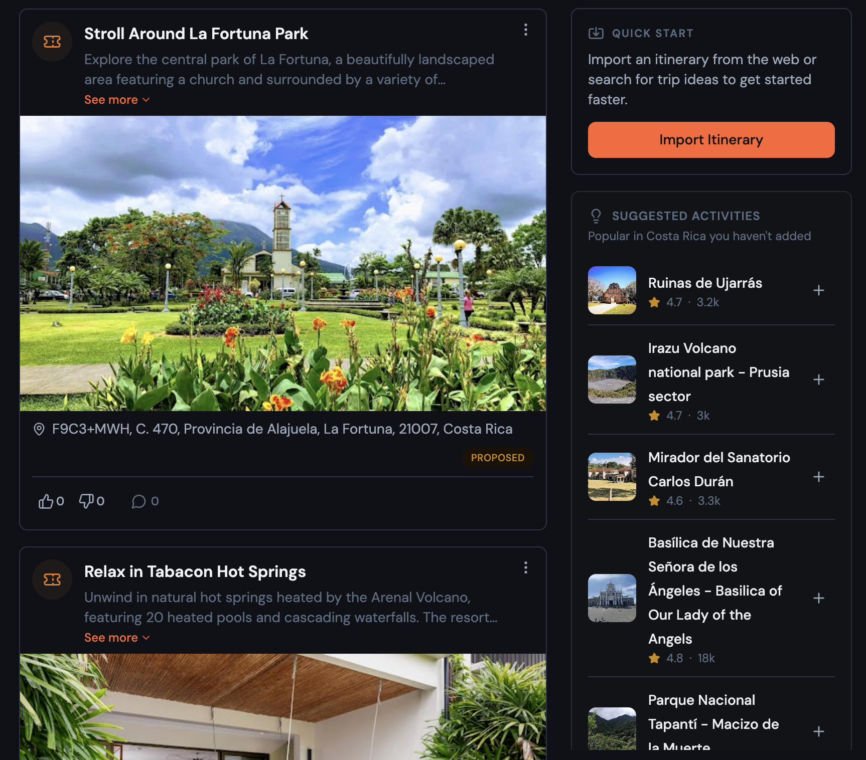
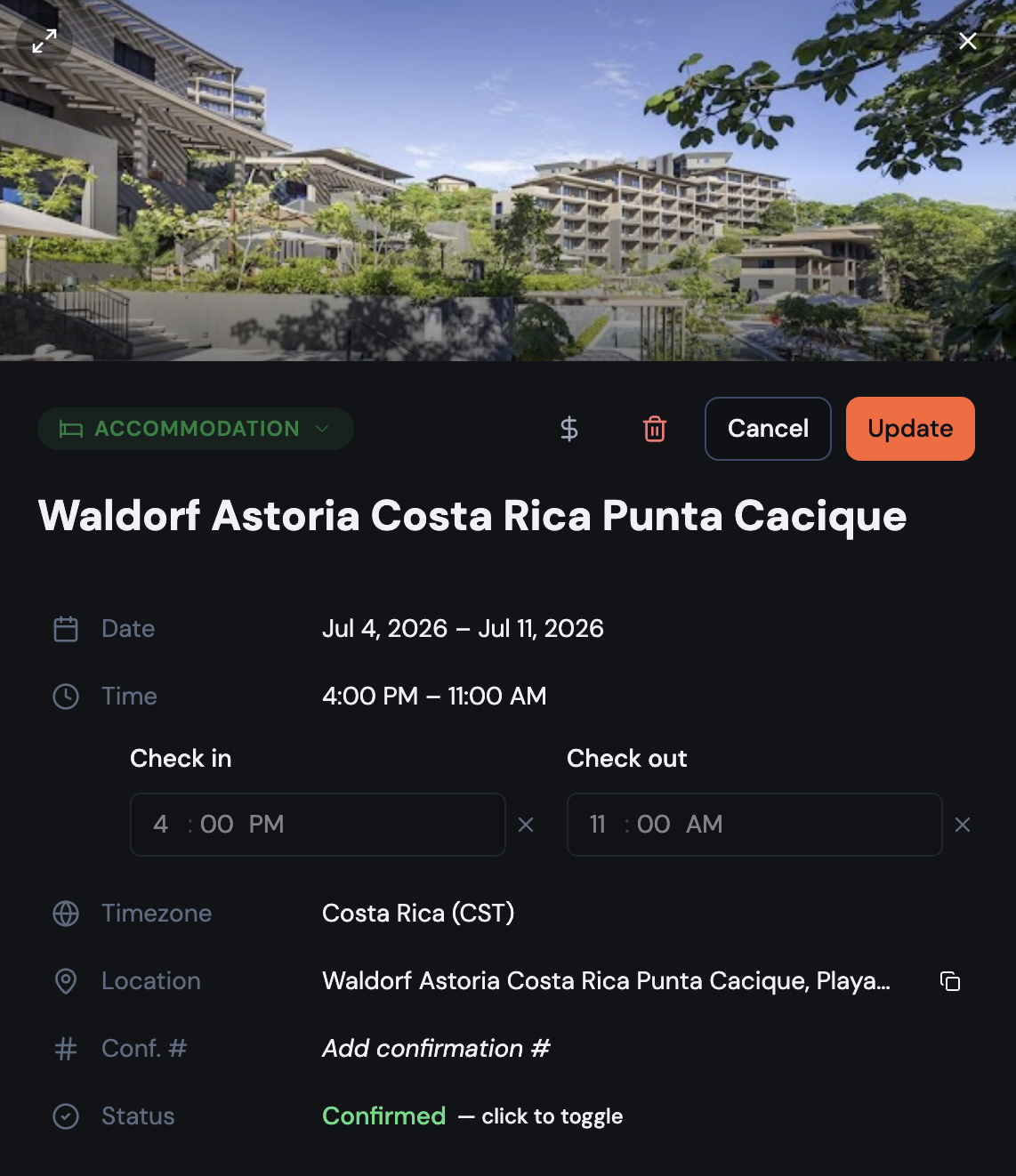
📋 A new way to view itinerary items
The item detail view has been completely redesigned. It's a document now — inspired by the way Notion shows structured content — rather than a traditional stacked form.
What changed:
- Place photo fills edge-to-edge at the top, with a color-coded fallback when no photo is available
- Properties (date, time, location, website, confirmation number, status) are interactive rows — tap one to expand it in place; everything else stays out of the way
- Comments appear inline at the bottom, no separate tab needed
- On desktop, a toggle opens the item in a two-column layout for more room
- Save and Cancel sit at the top, always visible without scrolling
It's a much better experience when you're mid-trip and just need to quickly check a time or copy a confirmation number.
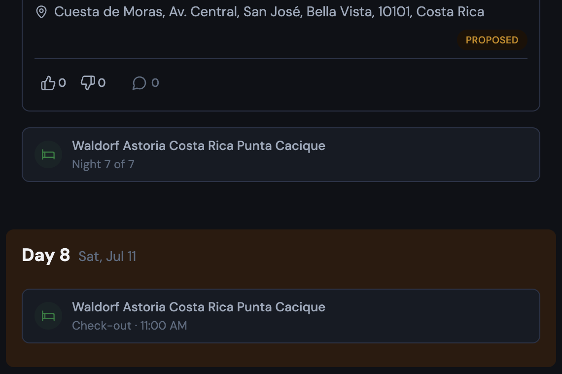
🏨 Multi-night stays actually make sense now
Add a five-night hotel and it would show up once — on check-in day — then disappear. The next four nights looked completely empty, like you'd forgotten to plan them entirely.
That's fixed. Multi-night accommodations now show compact ghost cards on every day of your stay. Mid-stay days show "Night 2 of 5" (or whichever night it is). Check-out day shows "Check-out · [time]" pinned to the top of the list. Tapping any ghost card opens the original accommodation item.
The map routing plays along too: on days you're staying somewhere, auto-routing starts and ends at your accommodation. You can turn this off in Route Options if you'd rather route manually.
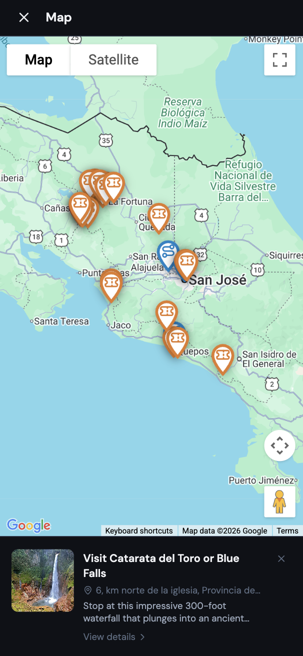
🗺️ A real map on mobile
There's a new floating button on mobile that opens a full-screen map overlay for your itinerary. Tap a marker to see its details in a bottom panel. It works the way a map on your phone should — full screen, tap to explore.
✈️ More worth mentioning
A lot of smaller things shipped this month that are genuinely useful:
Transport mode — transportation items now have a Mode field: Flight, Train, Bus, Car/Drive, Ferry, Cruise Ship, or Other. Selecting Flight adds optional Airline and Flight # fields. The flight number shows in its own labeled box with a one-click copy button.
Delete from the form — you can now delete an itinerary item or expense directly from its edit form. Trash icon in the header, confirm, done. No more hunting for a separate delete option.
View links that stick — switching between Calendar, List, and Map view now sticks — share a link or refresh the page and you land back in the right view.
Smarter forms by item type — the item form now shows only what's relevant. Notes hide the time, status, and confirmation fields (a note is just text). Dining hides the confirmation code. Accommodation auto-enables the time toggle since check-in/out times almost always matter.
Category picker for expenses — tapping "Add Expense" now opens a category selector first (Dining, Transportation, Accommodation, etc.) before the full form. The category is pre-filled when you get there.
Export to Google Maps — download your full itinerary and open it in Google Maps, Google Earth, or any mapping app. Items are organized by day, with typed icons for each category.
Custom time picker — the native time picker (which looks completely different on every device) has been replaced with a consistent AM/PM dropdown that works the same everywhere.
Pull-to-refresh on mobile — pull down from the top of the page to reload. A small circular indicator shows your pull progress and spins while it refreshes.
🐛 Fixes and polish
A few things that were quietly annoying are now quietly fixed:
- Map pins got a design pass: outlined style with type-specific icons and colors. Transportation is blue, accommodation green, activity orange, dining red. Much easier to read at a glance.
- Search results now show clean place names and readable descriptions — no more garbled text or link fragments.
- The import flow now uses an explicit "Open to Import" button that opens the source in a new tab, making it clear you should visit the page before importing.
- The expense form no longer resets mid-edit when the window regains focus.
- Date pickers close automatically after you select a date.
Go check it out → Try Bonder free
Planning a group trip?
Try Bonder free — the easiest way to plan trips with friends.
Try Bonder free →