Your Itinerary on the Map, in a PDF, and on a Brand New Overview Page
April was the month where the itinerary stopped being just a list. It's now a list and a map, and a downloadable PDF, and a calendar, and a dashboard. Basically we gave your trip data a bunch of new ways to be useful. Here's the rundown.
🗺️ Your itinerary and your map, together at last
The itinerary now has a persistent map panel docked on the right side of the screen. Your timeline lives on the left, the map lives on the right, and they talk to each other — click a day in the navigation and the map filters to that day's stops. Hover over an item and the matching pin highlights on the map. You can expand the map to fill the whole screen if you want to get a better look.
But the map isn't just showing what you've already planned. Toggle "Activities" or "Dining" at the top of the map, and the map populates with highly-rated places near your day's stops. Each suggestion shows up as a labeled pin with the place name, so you can scan the area without tapping each one. When you do tap, a popup shows the details, rating, and a one-tap "Add to Day" button. It just drops right into your itinerary.
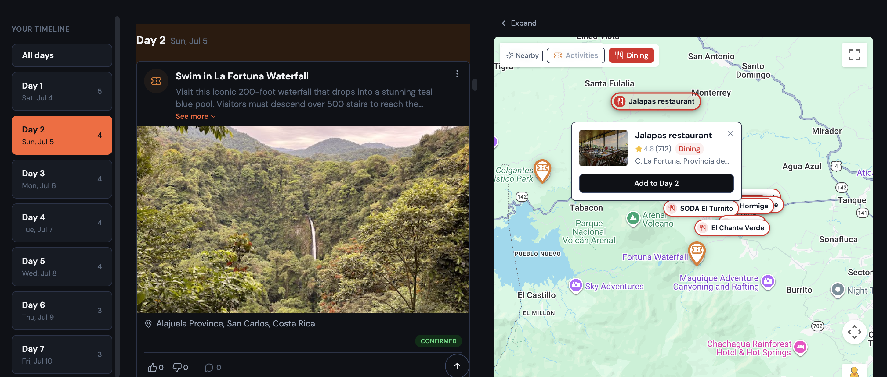
This is the kind of feature where you didn't know you needed it until you're staring at your itinerary for Florence thinking "okay but what's actually near the Uffizi for lunch?" Now you can just look.
- Places you've already added are automatically hidden from suggestions
- Works on mobile too — the full-screen map overlay shows the same suggestions
📄 Download your itinerary as a PDF
You can now download your full itinerary as a PDF. Not a "print this webpage" PDF — an actual designed document with a cover page, daily spreads, and structured entries.
Each day gets its own spread with entries for every confirmed item (plus any notes), and each entry surfaces all the stuff you actually need when you're offline: confirmation codes, flight details, check-in/check-out times, website links, and full addresses.
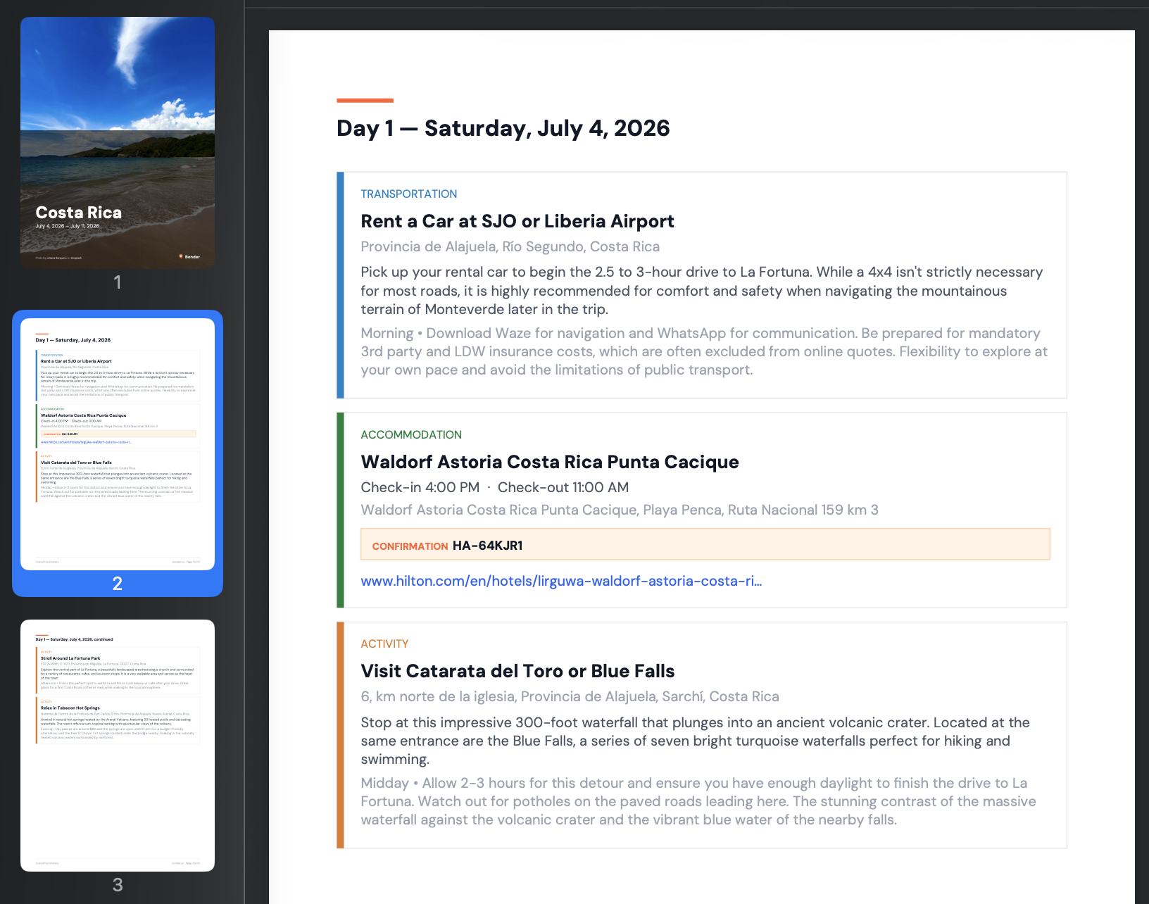
It's the thing you download before the flight, when you're not sure you'll have data. Everything you need, one file.
🏠 Trips open to an Overview now
Trips used to open straight to the itinerary. Now they open to an Overview tab — a snapshot of the whole trip in one place.
The Overview shows four key stats at a glance: accommodation coverage (with a green/amber indicator if you have gaps), flights, total cost, and what you personally owe. The trip's date range and countdown sit right under the destination name. And the group feed is here now too — no more separate Feed tab.
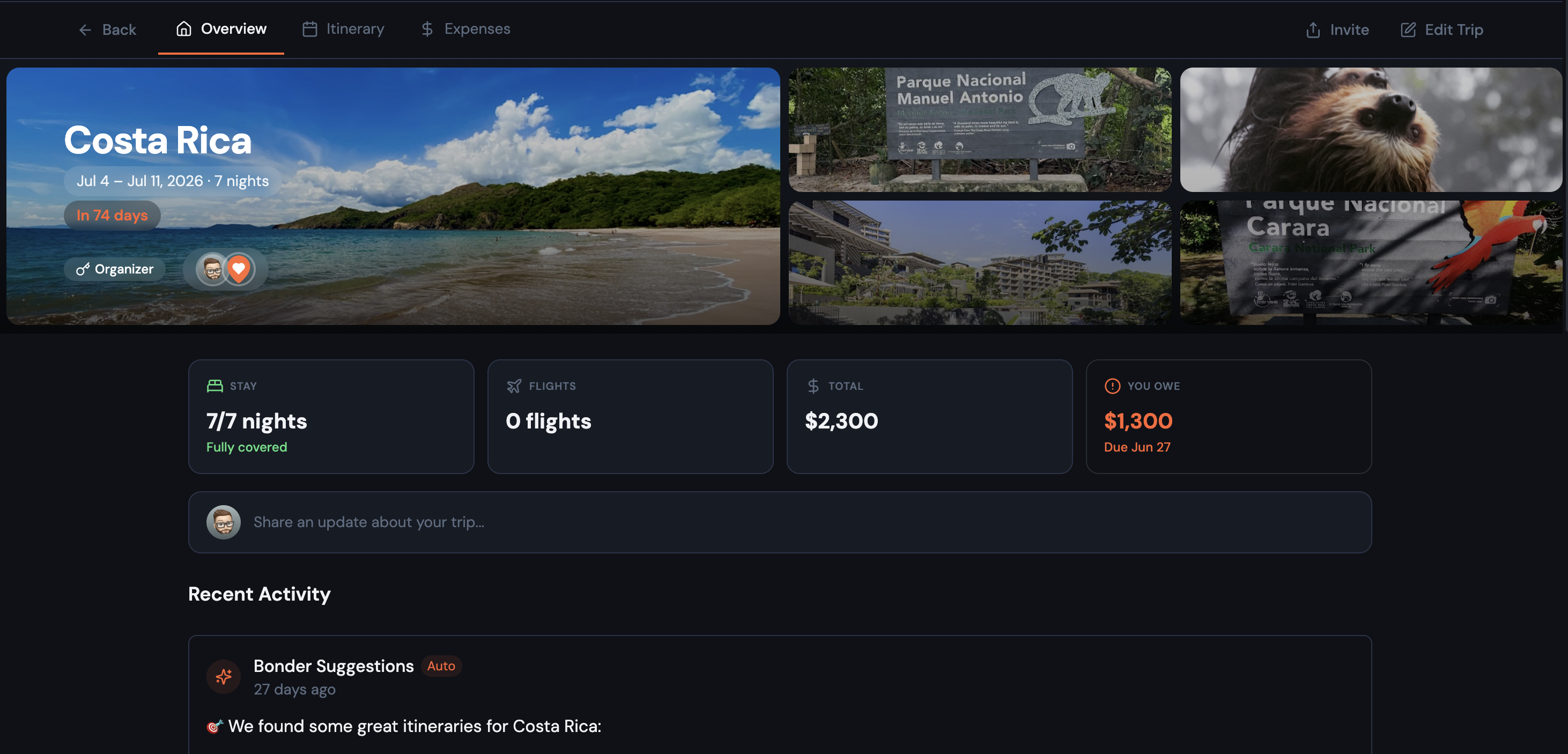
Speaking of the trip banner: when your itinerary items have photos, it splits into a collage — your trip image on the left, up to four item photos on the right. It's a nice visual summary that makes each trip feel distinct.
The navigation is now three tabs — Overview, Itinerary, Expenses — and the tab bar sits above the trip photo so it doesn't jump around when switching tabs.
✨ More worth mentioning
A real calendar view — the old Board view is gone, replaced by a proper month grid (think Google Calendar). You can see all your trip days at once, drag items between days, and click "+" on any day to add something. On mobile, days show dot indicators with a tappable detail section below.
Cleaner toolbar — the itinerary toolbar got simplified across the board. On desktop, Import/Print/Export moved into a "..." menu, filter pills are always visible (no toggle), and the standalone Map view is gone — Timeline and Calendar are the only views now. On mobile, Filters and Add moved to floating buttons. Less clutter, more content.
Expenses got a makeover — the expenses tab now mirrors the itinerary's layout: filters and actions on a single row on desktop, floating buttons on mobile, and a compact totals row instead of the old three-number grid.
Delete a trip — you can now delete a trip entirely from Edit Trip → Details → Danger Zone. It's intentionally buried to prevent accidents.
🐛 Fixes and polish
A few things that were quietly annoying are now quietly fixed:
- Typing in the location search field when editing an itinerary item no longer gets overwritten after a brief pause — that was a frustrating one
- Creating a trip on mobile no longer has buttons running off the edge of the screen
Go check it out → Try Bonder free
Planning a group trip?
Try Bonder free — the easiest way to plan trips with friends.
Try Bonder free →